Thank youA member of our team will start putting this together for you. We'll only send relevant examples — no spam, ever.Prefer a call? We're happy to talk it through it instead.
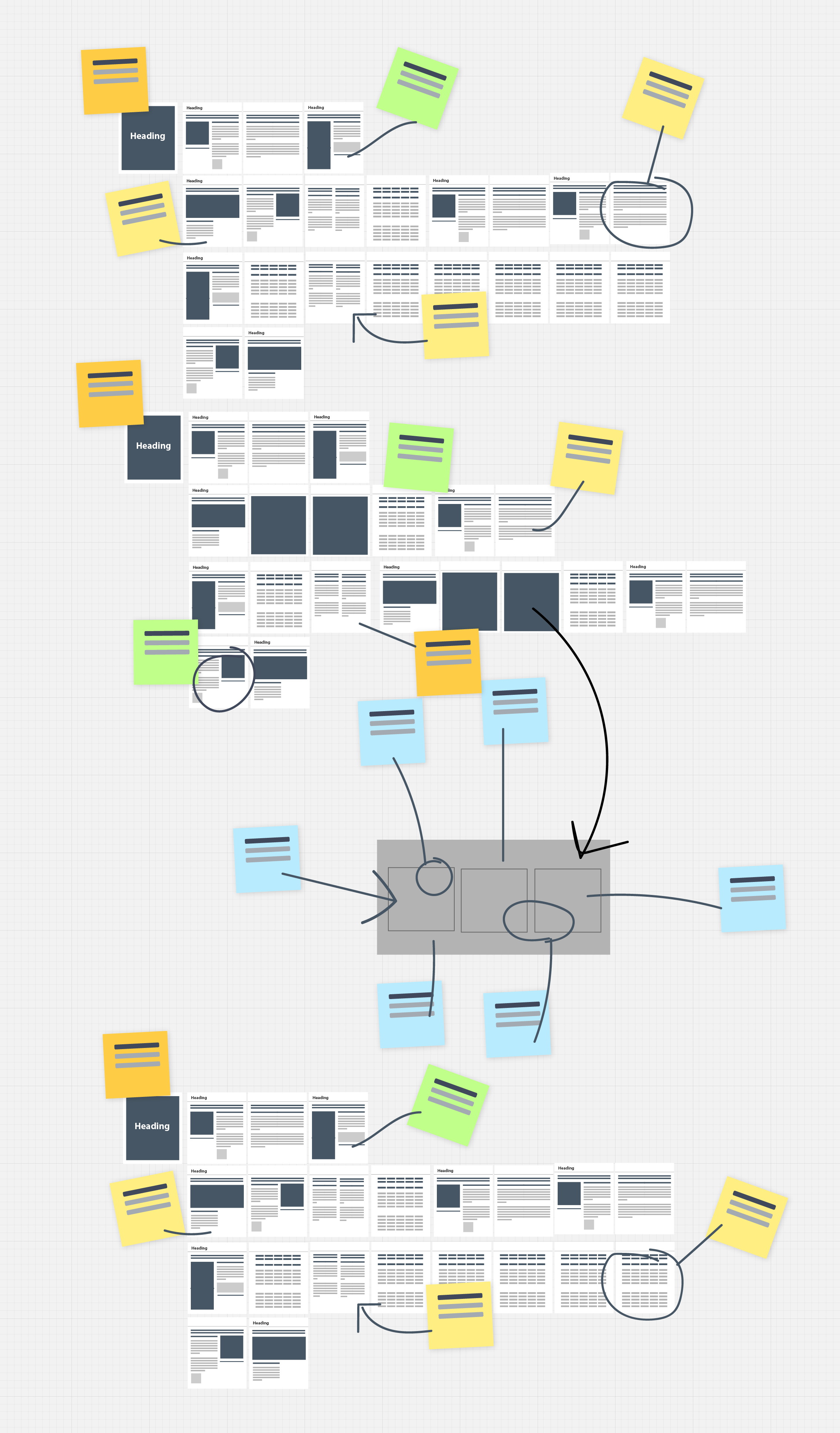
From interactive reports and digital brochures to event kiosks, self-assessment tools, and quizzes, these case studies highlight the variety of ways you can use PUBLEX to create engaging digital experiences.Explore our projects below
Building a clear, interactive brochureWe collaborated with Druck to present their hydrology sensor portfolio in a structured, layered format — making it easier to explore technical detail, compare products, and understand real-world use
Take a look
Creating an interactive magazineFrom static PDF to dynamic digital — we helped Close Brothers Asset Management transform their customer magazine, Wealth Matters, into an engaging, insight-driven experience.
Take a look
Creating a sales enablement asset catalogue appWe created a searchable sales toolkit for Proserv. It puts interactive content in the hands of their global team, with instant, offline access and easy sharing in the moment.
Take a look
Driving sustainable travel decisionsWe partnered with Deloitte to build an interactive carbon Emissions Calculator — turning business travel data into behavioural insight and real-world impact.
Take a look
Building an interactive landscapeWe created a digital landscape that lets users explore industries, uncover relevant technologies, and dive into detailed product content — all in one intuitive tool.
Take a look
Exploring the airside ecosystemWe helped ADB SAFEGATE turn a complex airport-wide product catalogue into an interactive brochure — making it easy for users to explore, compare, and understand their Airside 4.0 offering.
Take a look
Creating a smarter way to choose flowmeters
We worked with Panametrics to create a streamlined digital selector — helping users filter options, compare products, and request quotes with confidence.
Take a look
Creating a complex product selectorWe helped Druck simplify complex product selection with a powerful digital tool — enabling users to configure pressure sensors options in real time, request quotes instantly, and connect directly with sales.
Take a look
Creating a complex digital brochureWe worked with Proserv to convert their testing and calibration content into a structured, interactive Lex, making key information easier to access and understand
Take a look
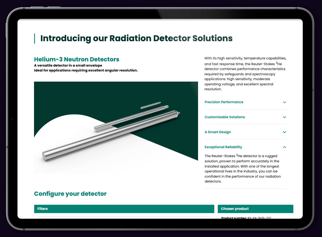
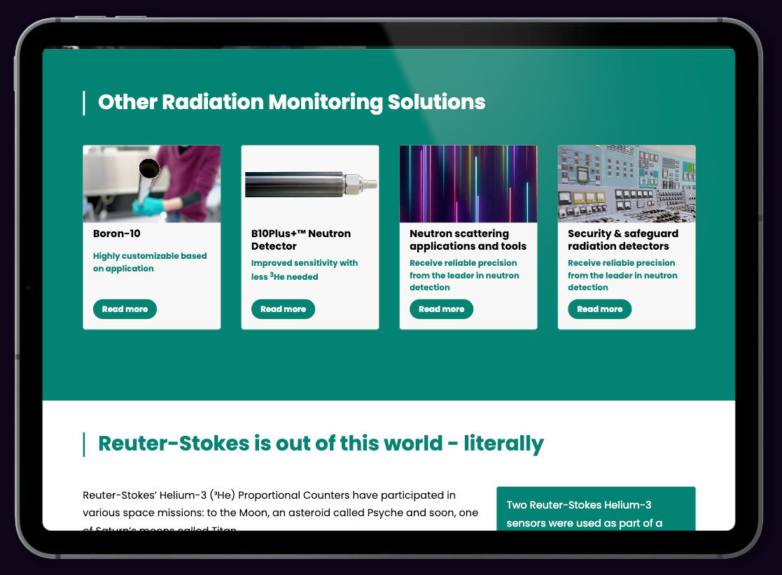
Guiding users through technical complexityWe created a guided configurator for Reuter-Stokes, helping users specify complex radiation sensors by selecting from nine key requirements—turning technical detail into clear, confident decisions.
Take a look
Turning decades of carbon data into a live story
In collaboration with Impulse, we built Erda Energy’s live carbon dashboard, combining real-time performance data with an intuitive interface that updates automatically and embeds seamlessly in their site.
Take a look
Playful quiz, delivered fast
Designbysoap created a cheeky quiz for cat lovers — we brought it to life in the browser with PUBLEX. Easy to embed, quick to build, and full of personality.
Take a look
Interactive data dashboard
Built for Axia Origin and the Riyadh Centre for Research & Studies, the Global Cultural Index lets users explore perception-based cultural insights through an elegant, interactive website and dashboard.
Take a look
Interactive Radiation Brochure with Guided Product Configurator
Helping Reuter-Stokes cut through product complexity with an intelligent, guided configurator built into a seamless interactive experience.
Reuter-Stokes produce a range of highly specific radiation sensors. With each new configuration requiring a separate technical drawing, navigating the product landscape was becoming a bottleneck — both for internal teams and external buyers.We created an interactive brochure with a guided product configurator at its core. Users can select from nine configurable requirements to explore the closest-fit options, or flag the need for something new, all within a clean, clear, and responsive format.
Clarify complex product optionsHelp customers explore the range by filtering based on key parameters like sensitivity, housing, and application.
Reduce engineering strainMinimise the creation of unnecessary bespoke drawings by surfacing close-fit products early in the enquiry process.
Connect interest with actionAllow users to generate qualified enquiries and contact the team directly, based on real configuration data.
Showcase real-world applicationsHighlight use cases, from space missions to national defence and embed rich media like NASA’s asteroid tracker.
Too many product variantsWith every new set of technical parameters feeling like a new product, the team faced increasing demands on time, clarity, and customer communication.Hard to self-navigateWithout a centralised view of what already existed, customers and engineers struggled to find or share the right fit quickly.Static tools holding them backRelying on PDFs and manual cross-checking made it difficult to scale conversations or capture interest efficiently.
We built a responsive brochure with a guided product configurator at its heart. Users select from nine configurable parameters to surface the most relevant product variants — or indicate when a custom build may be required. The tool sits alongside rich product content, visual use cases, and an integrated contact form for seamless enquiries.
Multi-criteria configurationUsers select from nine technical requirements, including housing type, energy range, and signal format, to see tailored results in real time.Contextual applicationsThe brochure includes practical examples from lunar exploration to national security that show how the detectors are used in the field.Embedded interactive mediaIncludes NASA’s “Eyes on the Solar System” visualisation — showing the live location of a mission using Reuter-Stokes technology.Live enquiry captureOnce a configuration is selected, users can request more info - generating a targeted email with their chosen specs straight to the sales team.
The guided configurator is now in use at Reuter-Stokes, helping their team present a complex product family in a way that’s easy to understand and act on. It reduces back-and-forth, speeds up technical discussions, and equips customers to make informed decisions on the spot.The result? A clearer, faster, and more interactive way to showcase precision technology, built for real-world conversations.
Need to turn complexity into clarity?Let’s talk about how we can design a guided configurator that empowers your team and simplifies your sales cycle.
Designing clarity around complexity
Transforming specialist knowledge into an interactive, explorable digital experience
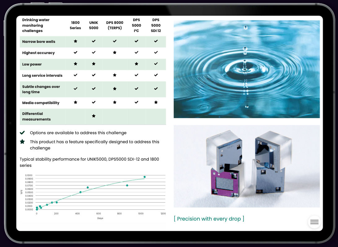
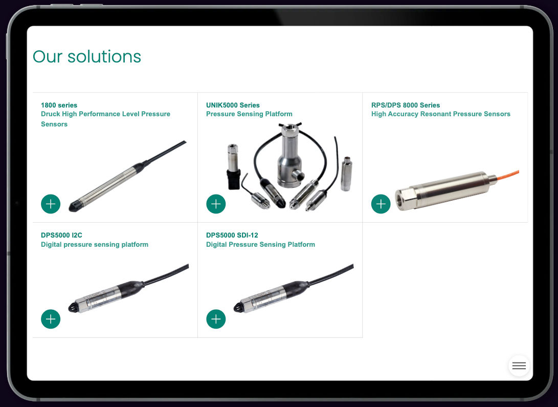
Druck's hydrology sensors are built for demanding environments, with a level of engineering detail that speaks for itself. The task was to create a digital brochure that could present that information clearly and help users explore it at their own pace.Working closely with the team, we developed an interactive Lex that adds structure, highlights key use cases, and gives readers the tools to find the information most relevant to them, without flattening the technical nuance.
Break complexity into layersRestructure the content to start with framing and allow users to drill down into detail when needed.
Design for interaction, not just displayUse visual markers, expandable modules and rich product visuals to make exploration feel intuitive and responsive.
Support exploration and comparisonHelp users find what’s relevant — whether they’re comparing products, scanning use cases or digging into technical data.
Highlight what makes Druck uniqueSurface the quality of Druck’s clean-room manufacturing and silicon sensor technology through focused, contextual storytelling.
Turning precision into a storyDruck’s sensors are high-performance instruments, used in demanding hydrological environments. But their technical edge wasn’t coming through in static PDFs or traditional product pages.Avoiding overloadToo much detail at once can make it harder to focus. The aim was not to reduce content, but to guide people through it in a way that felt manageable and intuitive.Connecting features to environmentsWith multiple hydrology settings in play, we needed to clearly show how specific sensor characteristics align with real-world use — without assuming prior knowledge.
We designed an interactive Lex that mirrors how real understanding happens: start broad, layer in detail, and let users explore at their own pace. The final result is a tool that empowers both technical experts and new audiences to engage with Druck’s offering, with clarity and confidence.
Application-first structureWe centred the content around three core use cases, using hotspot images to pinpoint exactly where and why each sensor performs best.Use-case navigationWe grouped content by environment and application, making it easier to see what each sensor is built for, and where it adds value.Clear comparison formatsProduct tables are styled for clarity and pace, helping users compare at a glance, without losing technical accuracy.Focus on manufacturing qualityA dedicated section on Druck’s clean-room fabrication and custom silicon element reinforces the message of uncompromising quality.
The interactive Lex offers Druck a new way to present their pressure sensor portfolio, structured around clarity, not just content volume. Whether someone is exploring options or looking for specifics, the experience adapts to suit.By building around user needs and keeping depth available but optional, the brochure works just as well in a boardroom conversation as it does in field research planning.
Bringing clarity to technical content?If you’ve got a product, service or system that deserves more than a PDF, we can help you build a structured, interactive tool that supports real understanding. No fuss. No overclaim. Just better conversations.
Digital Transformation of a Financial Magazine
Transforming a traditional financial magazine into an engaging, dynamic, data-driven digital experience.
Close Brothers Asset Management publish a high-quality magazine to inform and engage its customers. However, the traditional format — print and static PDF — presented limitations. Distribution was restricted and the PDF format offered no visibility into how readers were interacting with content.The client approached us with a clear brief: reimagine their magazine in a digital format. They wanted an engaging, interactive experience that preserved the editorial feel of print, but added the advantages of rich media, accessibility, and data tracking.
Digitize the print magazineCreate an interactive, responsive web version that reflects the aesthetic of the original print edition.
Boost reader engagementDesign a user-friendly experience optimised for all devices — from desktops to tablets and smartphones.
Get actionable insightsTrack reader behaviours such as article views, time on page, and drop-off points to inform future content strategy.
Make it interactiveEmbed video, links, and other rich media to elevate the reading experience and add value beyond print.
Preserving Print Design in a Responsive FormatMaintaining the visual identity and layout consistency across varying screen sizes.Creating Intuitive NavigationReplacing the familiar page-flipping experience with seamless digital transitions that still feel editorial.Balancing Analytics with User ExperienceImplementing in-depth tracking while ensuring a clean, unobtrusive interface for readers.
We created a bespoke digital version of the magazine that captured the editorial charm of the original print edition, while introducing the interactivity and insight only digital can offer.
Dynamic LayoutsWe designed flexible layouts that adapted beautifully across devices. The digital issue opened with a cover page, followed by a content menu modelled on the print magazine — retaining its editorial character while enabling digital flexibility.Seamless NavigationReaders could move fluidly between articles. A fixed sidebar mimicked a magazine spine, offering quick navigation back to the contents or forward to the next piece.Interactive Media IntegrationWe embedded videos, live links, and subtle animations within articles to bring them to life — transforming static pages into rich, multimedia storytelling.Advanced TrackingBehind the scenes, we implemented detailed analytics. The client could track which articles were most read, how long readers stayed, and where they dropped off — arming them with meaningful data to shape future editions.
This project is a clear example of how digital transformation can unlock the full potential of editorial content. By shifting from print to interactive digital, the client not only modernised their publication but also opened new doors for audience engagement and strategic content planning.The result? A future-ready magazine experience — rich, measurable, and deeply aligned with user needs.
Want to see what's possible for your business?Add your details and we'll put together some tailored examples based on what you do.
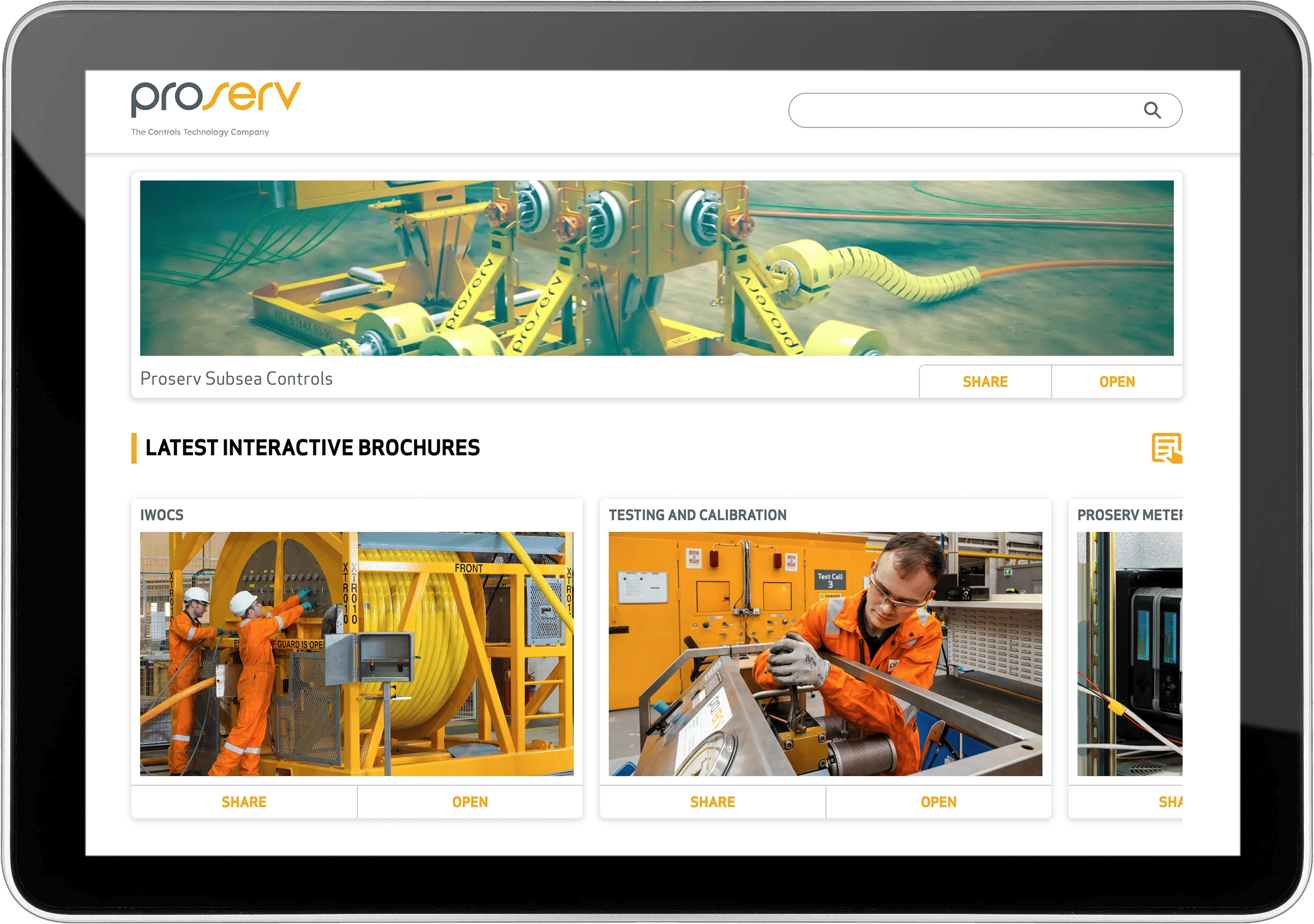
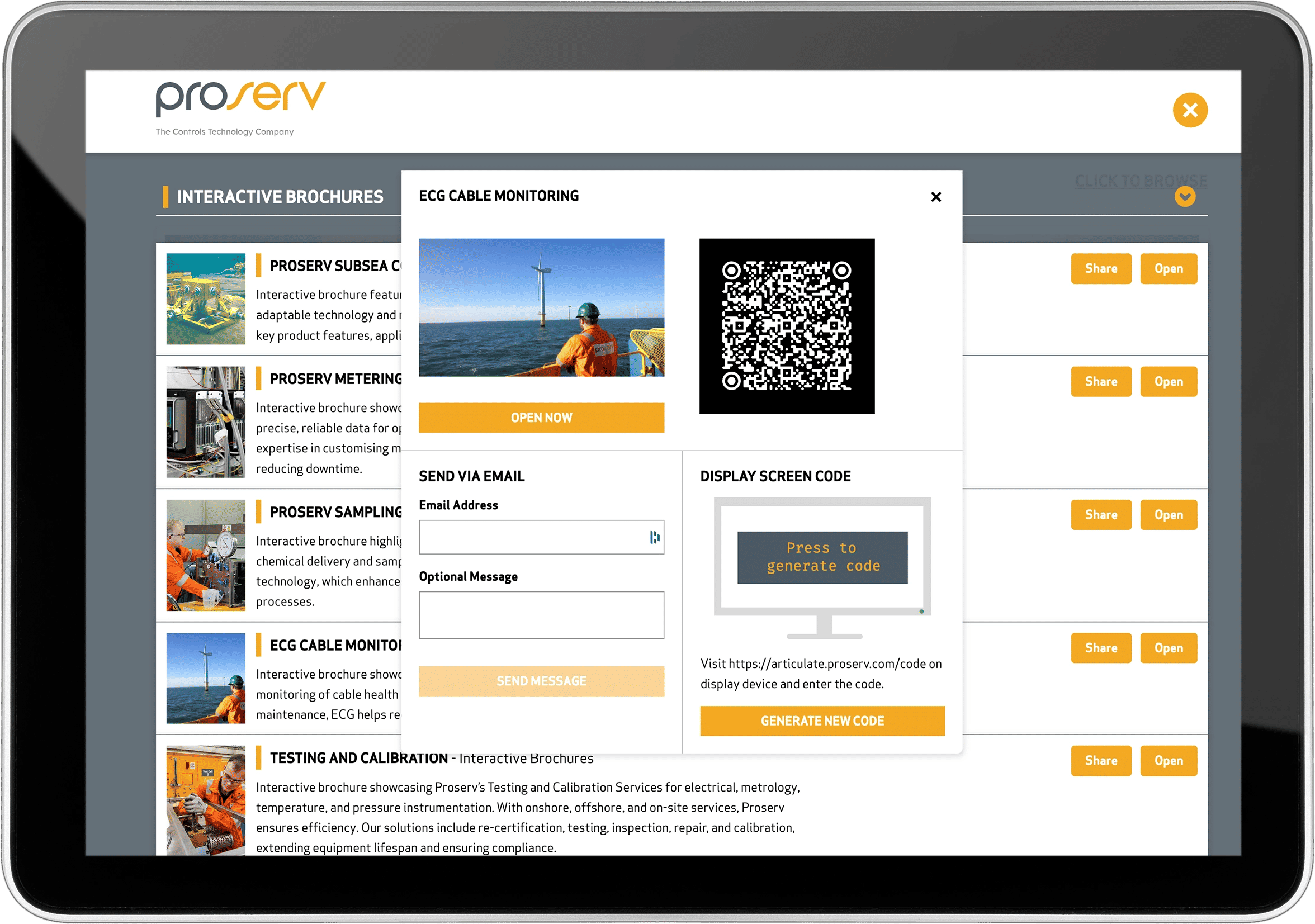
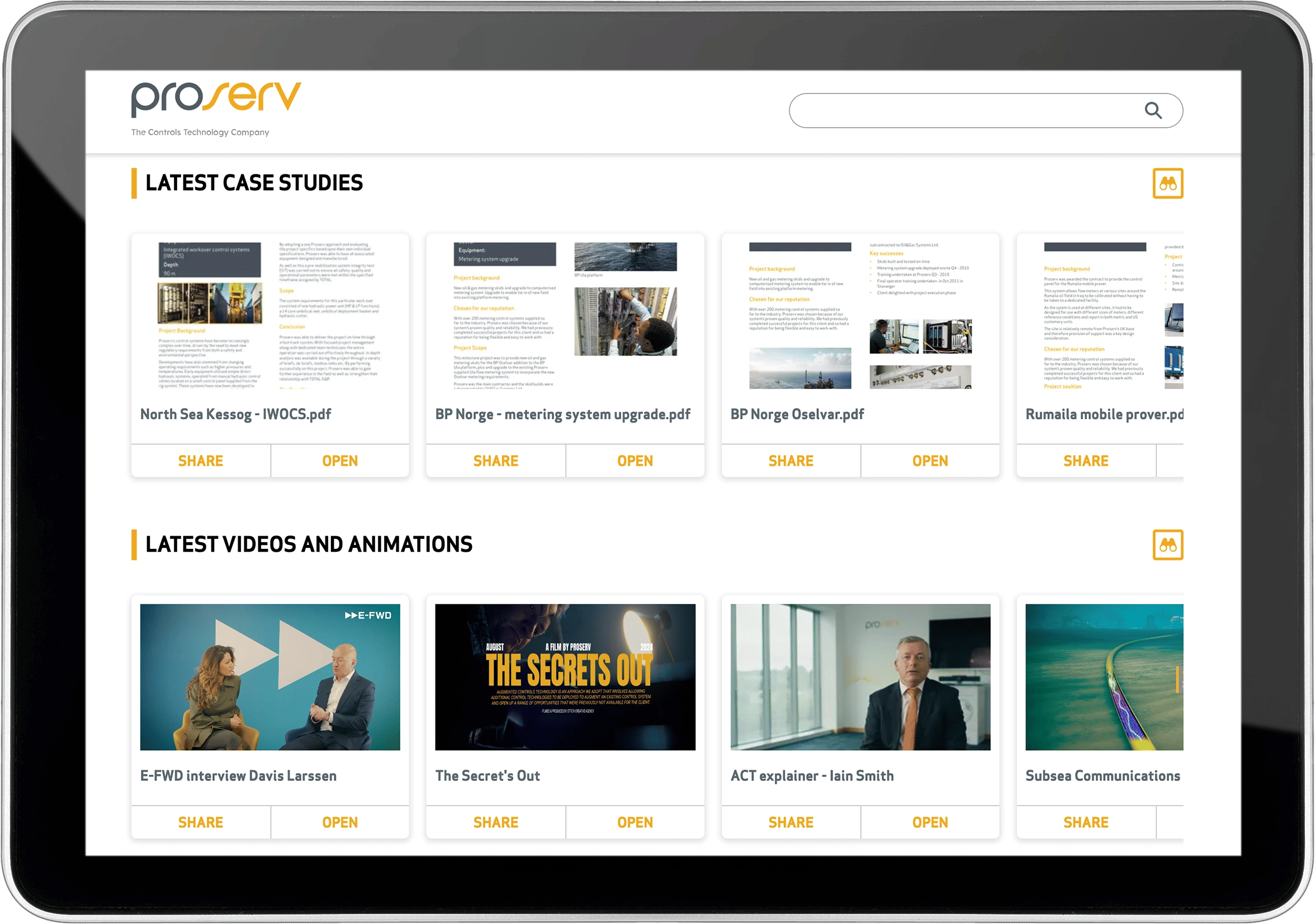
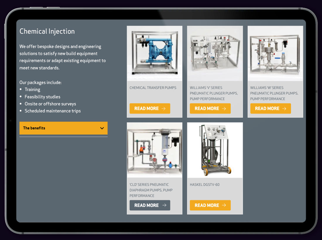
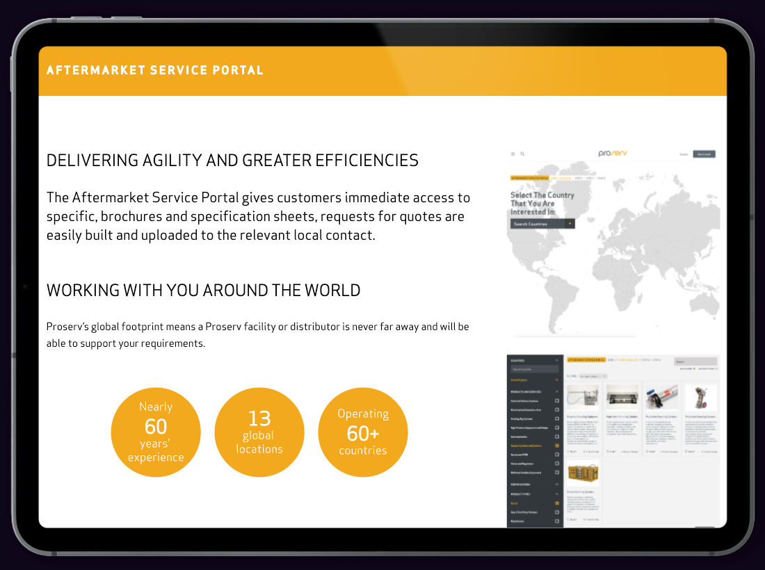
Sales Enablement Asset Catalogue for Proserv
An installable, searchable toolkit putting interactive sales content in the hands of the team — wherever they are.
Proserv needed a better way to equip their global sales team with up-to-date, on-brand content — from interactive tools and brochures to product sheets and case studies. The solution? A lightweight, installable sales enablement app that brings everything together in one searchable, offline-accessible toolkit.Designed to work across desktop, tablet, and mobile — and tailored around Proserv’s business units and user needs — the app ensures the right materials are always at hand, helping sales conversations flow and enabling faster, more confident decision-making.
Empower field sales teamsEnsure teams have fast access to the latest sales materials — wherever they are — even offline.
Centralise contentBring brochures, self-assessments, product configurators, case studies, and data sheets into one branded environment.
Streamline user experienceEnable intelligent browsing and full-text search across all formats, including interactive tools and documents.
Support smarter sharingAllow content to be shared instantly via email, QR codes or shortcodes — perfect for real-time conversations.
Sales conversations need immediacyIn high-pressure conversations, there's no time to go hunting for the right PDF or presentation. Proserv needed a way to bring all their materials together in a format designed for instant access and slick delivery.Traditional content systems fall shortWebsites and shared drives aren’t optimised for face-to-face conversations. The sales team needed something faster, smarter, and built around how they work.Content silos limit product knowledgeWith so many products and tools, it’s easy to miss what’s available. A centralised catalogue supports discovery, training, and better product confidence across the team.
We created an installable, branded Sales Enablement Asset Catalogue App — built as a Progressive Web App (PWA) and packed with Proserv’s latest interactive and static content. Fully searchable, offline-ready, and tailored to their business structure, the app gives sales teams everything they need — right in their pocket.
Searchable Content HubBrowse or search across all materials — from PDFs and PowerPoints to product configurators, data sheets, and case studies.Installable App (PWA)Accessible via browser or installable across iOS, Android, and desktop — no app stores required.Offline AccessOptimised for in-the-field usage, with offline access ensuring reliability even without a connection.Intelligent Sharing ToolsSend content directly via email, QR code, or shortcodes — ideal for live interactions, events, or follow-ups.Flexible Content StructureOrganise by business unit, industry, or product category — tailored to reflect the way your business actually works.
The Proserv Sales Enablement App transformed how their team communicates — putting the full breadth of the business at their fingertips. Whether on the shop floor, at an event, or in a client meeting, salespeople now have the confidence, clarity, and content they need — right in the moment.It also helps with internal learning — encouraging salespeople to explore the full range of tools and services, discover new products, and deepen their product knowledge. Simple to deploy, lightweight to run, and fast to update, it’s a smart investment that delivers impact fast.
"One of the most effective projects I have worked on... the Proserv BD and Commercial teams now have the knowledge required to answer customer questions in their hand."Spencer BuchanHead of Marketing & Communications
Want to find out more?Let’s talk about building a searchable, installable sales toolkit tailored to your business.
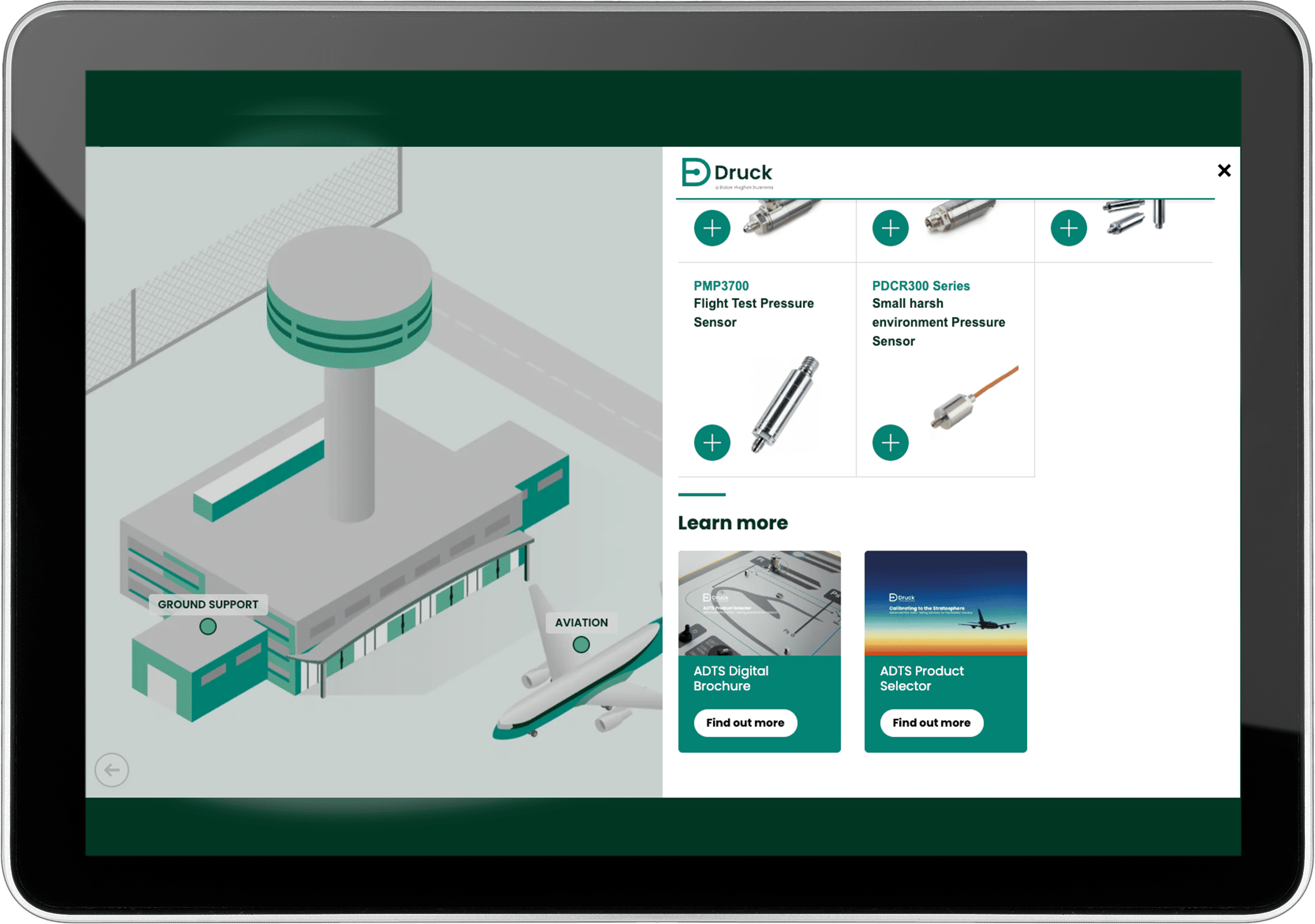
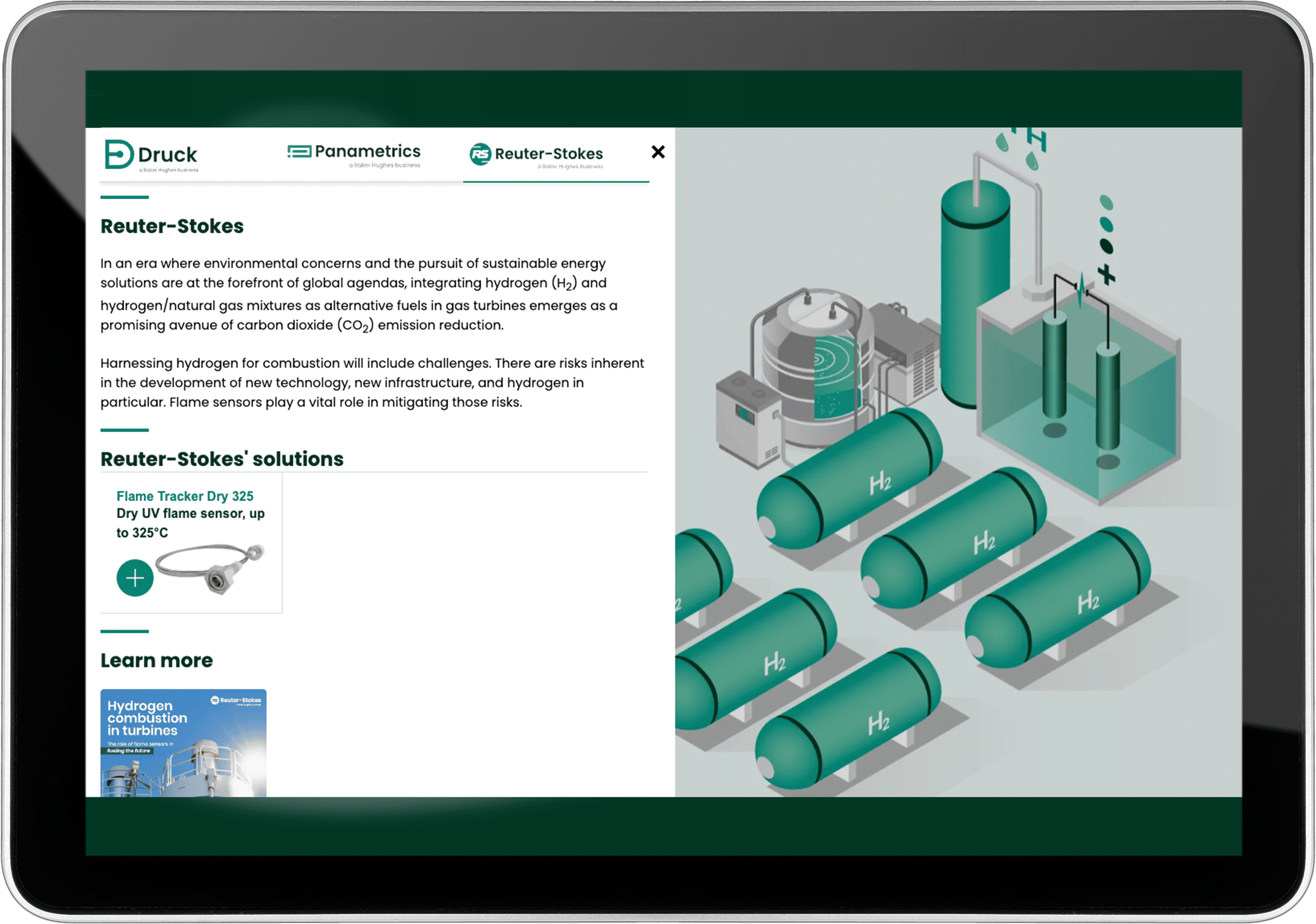
Building an interactive landscape for an engineering company
Turning complex engineering solutions into an intuitive, interactive experience that informs, engages and enables clearer understanding.
Druck, Panametrics and Reuter-Stokes — three sister companies specialising in advanced engineering solutions — needed a compelling way to present their collective offering to a diverse, technical audience. While each brand had a strong individual presence, traditional communication approaches made it difficult to clearly convey the full breadth of their solutions across multiple industries. The result was a missed opportunity to fully showcase their shared value proposition in a cohesive, user-friendly format.The goal: a digital experience that clearly presented their combined capabilities and let users dive in at their own pace — from industry overview to product-level depth.
Show the whole pictureCreate an interactive tool that makes it easy to understand the shared landscape of three companies, highlighting their role in key industries.
Enable layered explorationAllow users to start with a big-picture view and progressively drill down into more detailed product and service information.
Support user-led journeysDesign for flexibility — users should be able to browse organically or follow a guided path depending on their needs.
Drive deeper engagementLink to interactive brochures, product selectors, and other tools to support further discovery and encourage action.
Structuring complex contentWith three companies offering solutions across a wide range of industries, we needed a framework that could simplify without oversimplifying. We used industries as a starting point and carefully mapped what content should appear at each level.Designing for everyoneThe tool had to work for high-level decision makers and technical specialists alike — each with different priorities and levels of detail. Content had to flex around user needs without becoming fragmented.One screen, many layersWe needed to fit a complex ecosystem onto a single screen without overwhelming users. It had to feel spacious, interactive and connect naturally to supporting materials across devices.
We developed a bespoke interactive landscape, designed to guide users through a multi-level exploration of Druck, Panametrics and Reuter-Stokes’ combined value proposition.
Zoomable industry landscapeAt the top level, users see a high-level industry view, visually mapping out where each company operates and adds value. This bird’s-eye perspective sets the stage for deeper exploration.Layered navigationClicking into an industry opens an overview of offerings within that sector. From there, users can drill down into specific technologies, services, and products — uncovering detailed information step by step.Seamless linking to deeper contentWhere needed, we connected relevant sections to existing interactive brochures and product selectors — allowing users to seamlessly jump to rich, detailed content without breaking their flow.Multi-Platform readyThe landscape was built to work across touchscreens, tablets, and browsers — making it ideal for both one-to-one sales conversations and exhibition environments.
This project showcased how the right digital tool can simplify complexity without losing impact. The interactive landscape has made it dramatically easier for Druck, Panametrics and Reuter-Stokes to articulate their combined value — whether used on the show floor, in a boardroom, or embedded on their websites.The tool encourages exploration, supports a range of user journeys, and connects effortlessly to supporting materials. Most importantly, it empowers the client to communicate not just what they do — but why it matters.The result? A clear, compelling digital experience that brings coherence to a complex offering and invites users to dive deeper, on their own terms.
Want to find out more?Get in touch to find out how we can help you.
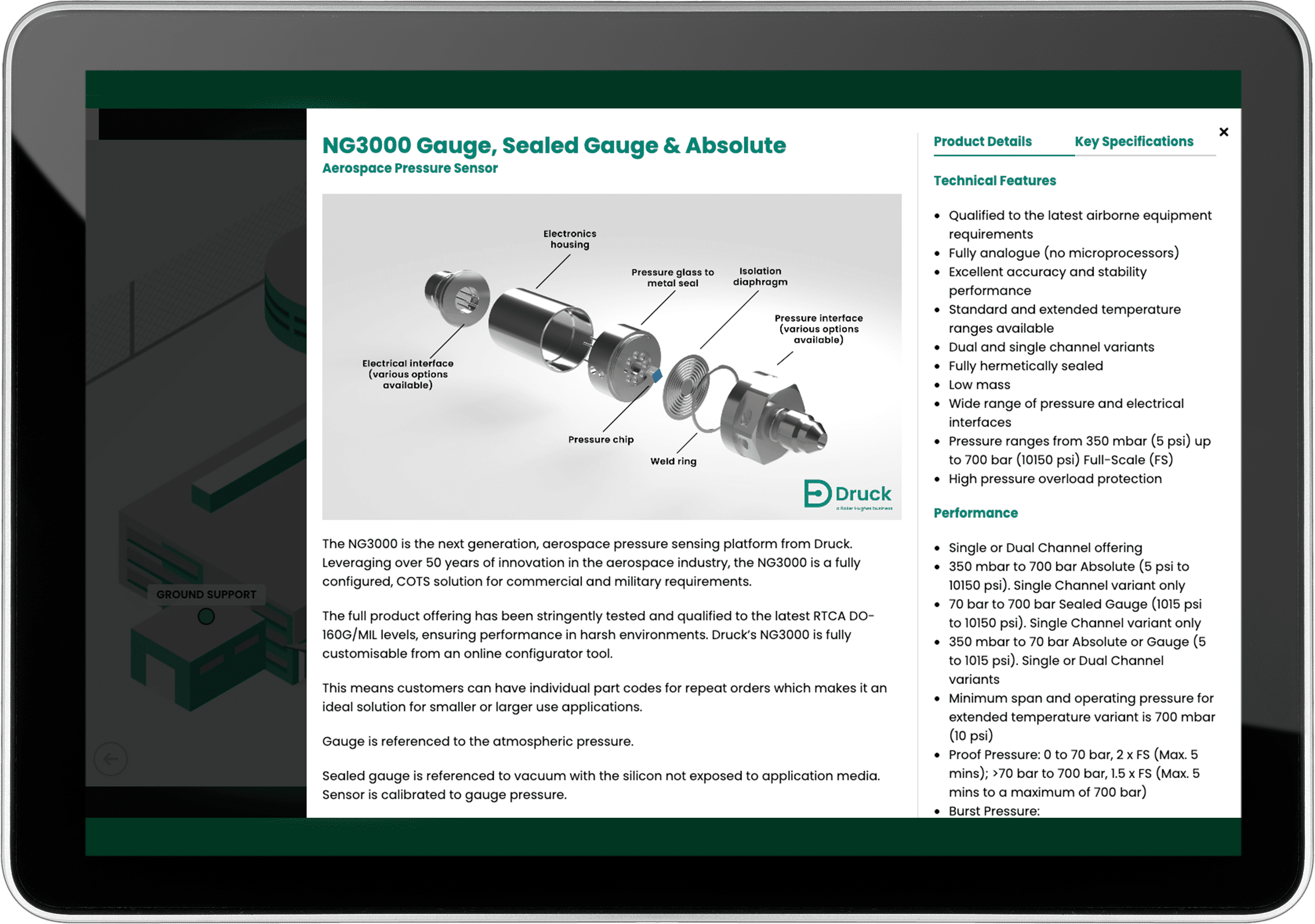
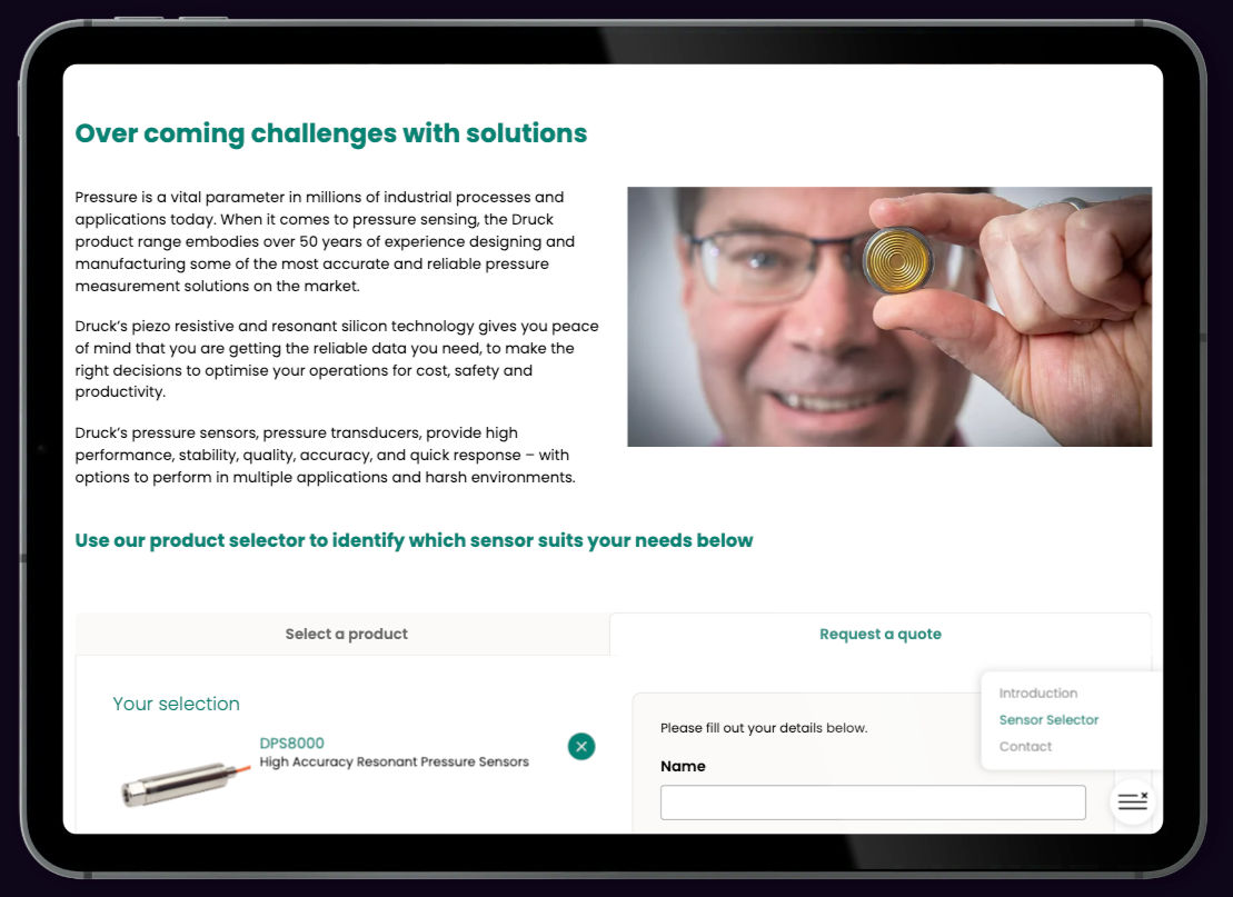
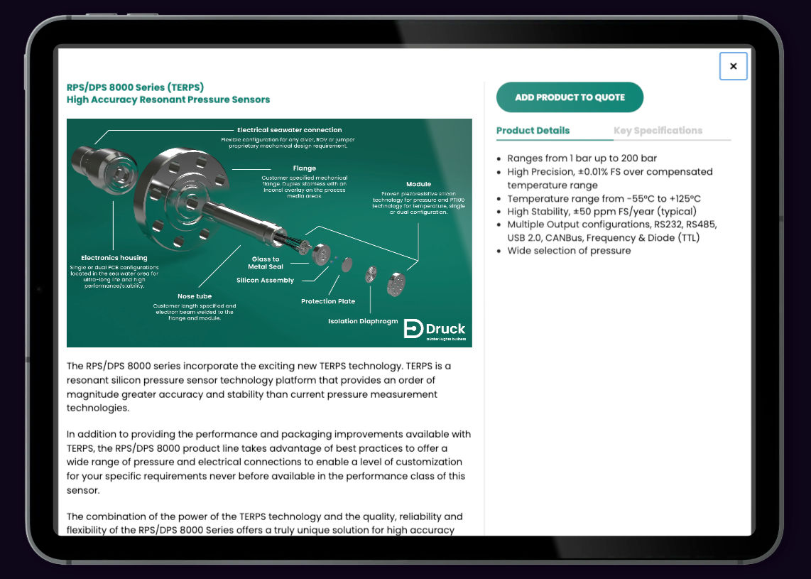
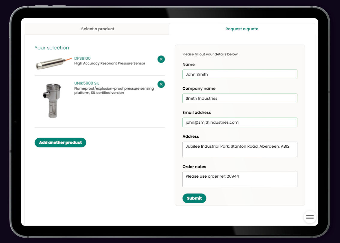
Complex Product Selector for Industrial Pressure Sensors
Helping Druck’s customers find the right sensor with a powerful, configurable product selector.
Druck, a specialist engineering company known for its highly specific industrial pressure sensors, needed a way to help users select the right product from a complex range. With seven key configuration variables and dozens of possible combinations, it was easy for customers to get lost or overwhelmed — and for sales teams to spend time manually guiding every enquiry.We built a custom interactive product selector to simplify this process, streamline product discovery, and connect directly to sales workflows — all while enhancing the user experience and improving conversion.
Simplify product discoveryMake it easy for customers to configure the right pressure sensor based on their technical requirements.
Streamline sales processRemove friction from the sales funnel by reducing manual back-and-forth and giving sales teams qualified, accurate enquiries.
Enable quoting and integrationAllow users to request a quote directly through the selector — automatically sending notifications and connecting to Druck’s CRM and marketing systems.
Better customer experiencePresent the complex range in a clean, intuitive format — building confidence and encouraging action.
Navigating complexityWith multiple product variants based on pressure range, mounting style, electrical output, accuracy and more — the choice matrix was difficult to communicate clearly online.Reducing manual overheadWithout a digital tool, customers had to rely on PDF datasheets and direct sales conversations to work through their options — taking time and creating friction.Capturing sales interest in real timeEven when users found the right product, there was no easy way to register interest or trigger sales engagement without leaving the page.
We designed and built an interactive product selector tailored to Druck’s industrial sensor catalogue. Users can adjust seven key variables, view matching products in real time, and access detailed information including imagery, benefits, and datasheets. A built-in quote request feature notifies the sales team immediately and feeds into Druck’s marketing automation platform.
Multi-variable product filteringUsers configure the product based on pressure range, output type, mounting, approvals, and more — with live filtering as they go.Smart results displayMatching products are shown instantly with imagery, summaries, and links to full technical detail and downloadable specs.Quote request integrationUsers can request a quote directly from the selector. Notifications are sent to internal teams and details are passed to Druck’s Marketo-based sales and marketing system.Frictionless UXDesigned for engineers and specifiers, the interface balances depth with simplicity — helping users quickly find what they need, without compromise.
The product selector has transformed how Druck presents its sensor range online — making it easy for customers to configure and explore products, while giving the sales team more qualified leads. The integration with Marketo ensures enquiries are tracked and acted on instantly, speeding up the entire sales journey.The result? A smarter, faster, more connected product experience — helping Druck win business and support customers with clarity and confidence.
Want to build your own product selector?Let’s talk about how interactive tools can simplify complexity and accelerate your sales process.
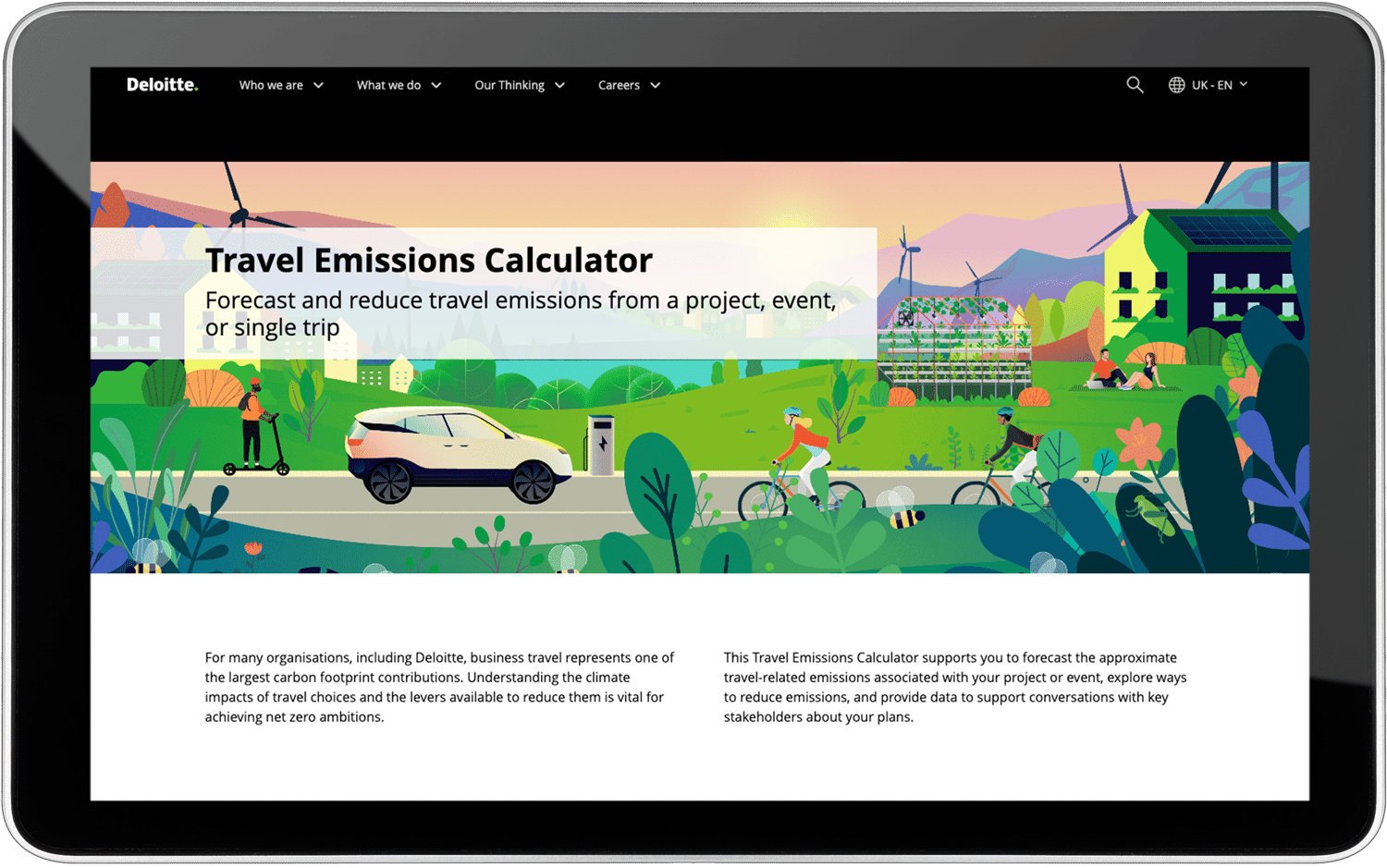
Carbon Emissions Calculator for Deloitte
Turning travel data into actionable sustainability insights for Deloitte’s global workforce.
Deloitte approached us with a unique challenge: to develop a tool that would raise awareness of the carbon impact of business travel and encourage more sustainable behaviour. The result was the Emissions Calculator — a user-focused digital tool that combines real-time data analysis, interactive personalisation, and behavioural nudges to make the carbon impact of travel decisions tangible, measurable, and actionable.
Raise awareness of travel emissionsHighlight the carbon footprint of business travel and empower employees to make more informed, eco-conscious choices.
Support behavioural changeEncourage users to experiment with different travel scenarios and understand the real impact of their choices.
Enable personalised travel planningOffer individual and group-based tools for calculating, comparing, and sharing carbon impact across trips and teams.
Make data simple and accessibleDesign an intuitive experience that simplifies complex data and makes insights accessible to all users.
Sustainability needs visibilityCarbon emissions from business travel are often abstract and invisible to employees. Deloitte wanted to give their teams a way to see — and reduce — the impact of their choices.Travel scenarios are complexFrom solo short trips to recurring international travel involving multiple team members — planning for sustainability required a tool that could handle complexity without confusing the user.Insight is only useful if it drives actionDeloitte needed a solution that didn’t just show carbon data — but used it to influence behaviour in meaningful, measurable ways.
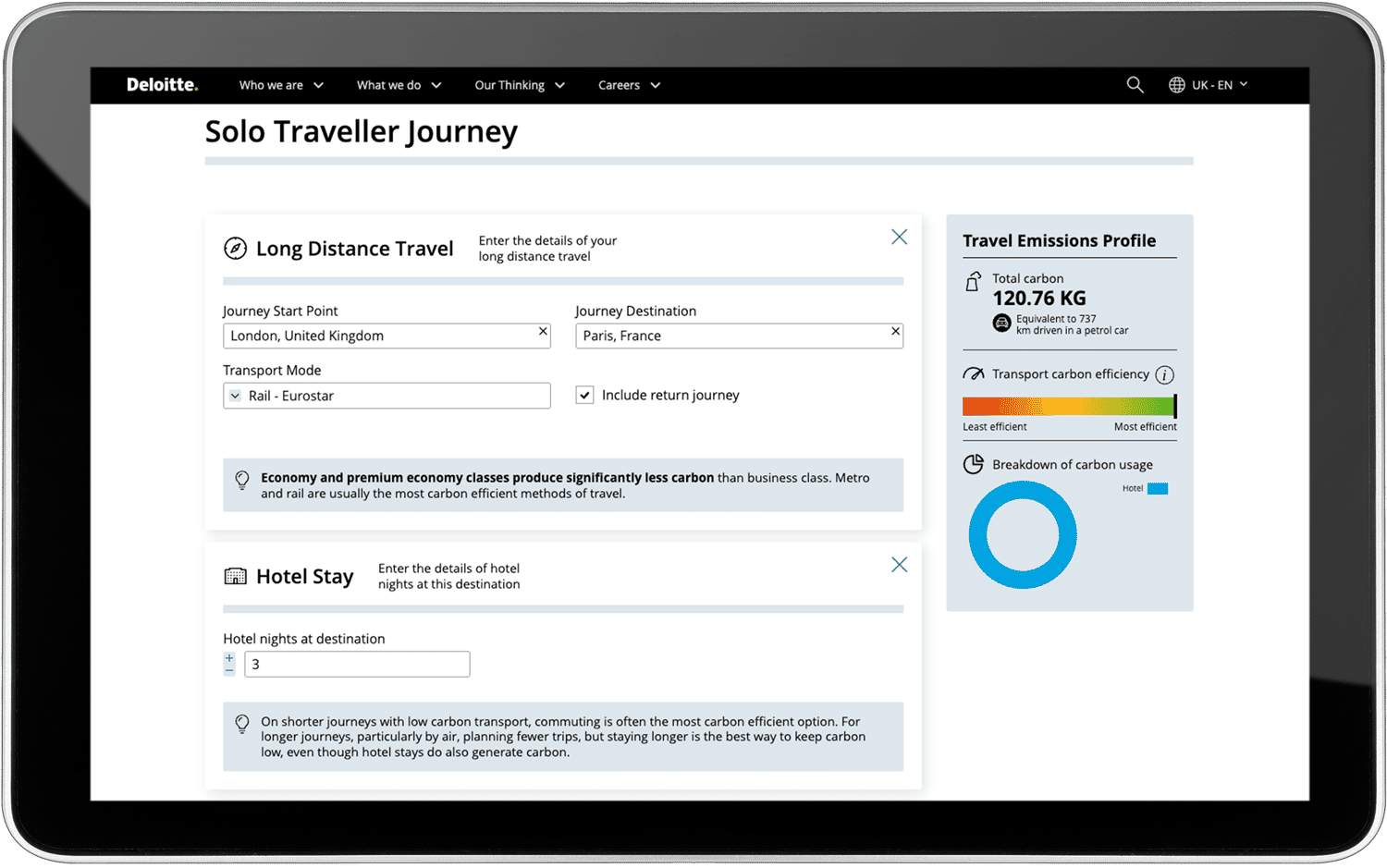
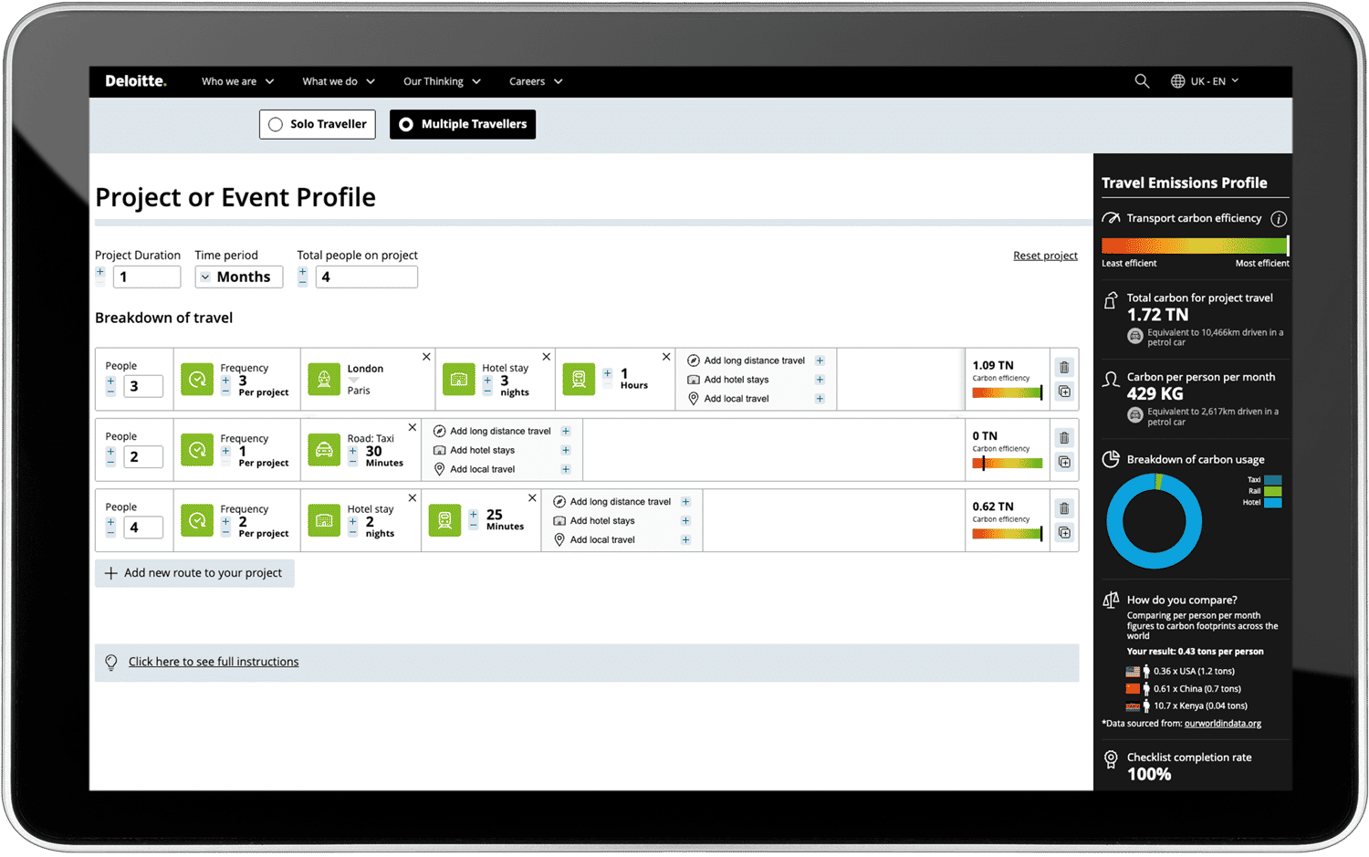
We developed an interactive Emissions Calculator that makes the impact of business travel clear — and changeable. Users can input travel details in Solo or Multiple Traveller modes, instantly view carbon impact, and experiment with different choices. The tool turns complex sustainability data into accessible, impactful insight that supports Deloitte’s net-zero goals.
Solo Traveller ModeUsers create detailed travel itineraries and compare emissions across transport types — from electric vehicles to long-haul flights — helping them make low-carbon choices.Multiple Traveller ModeIdeal for project teams and recurring journeys, this mode allows users to factor in frequency, group size, and trip duration — showing how small changes can scale to major carbon savings.Behavioural NudgesReal-time feedback highlights the carbon impact of each choice — encouraging users to explore alternatives and adopt more sustainable patterns.Sharable ReportsUsers can generate a detailed visual summary of each travel plan, download it as a PDF, or share via a unique link — making insights portable and collaborative.
The Emissions Calculator has been widely praised for making carbon data engaging, accessible, and actionable. By turning complex information into interactive choices, the tool helps Deloitte drive real behaviour change at scale — supporting their sustainability targets while empowering employees to take ownership of their impact.It’s a clear example of how purposeful digital design can influence culture, reduce carbon, and create lasting value for people and planet.
Want to create a tool that drives real change?We’d love to show you how digital tools like this can turn data into impact — and support your sustainability journey.
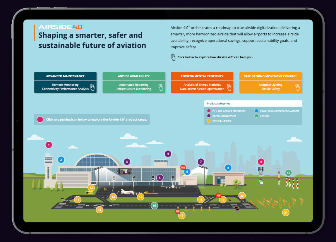
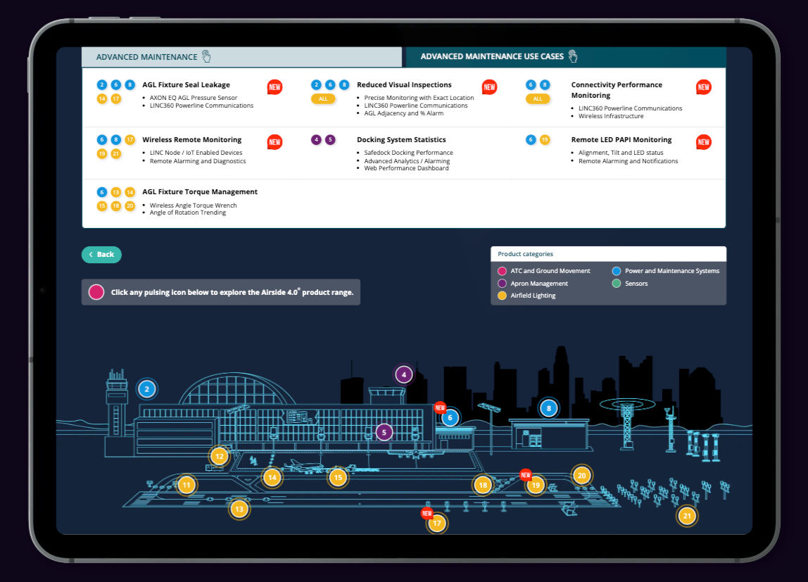
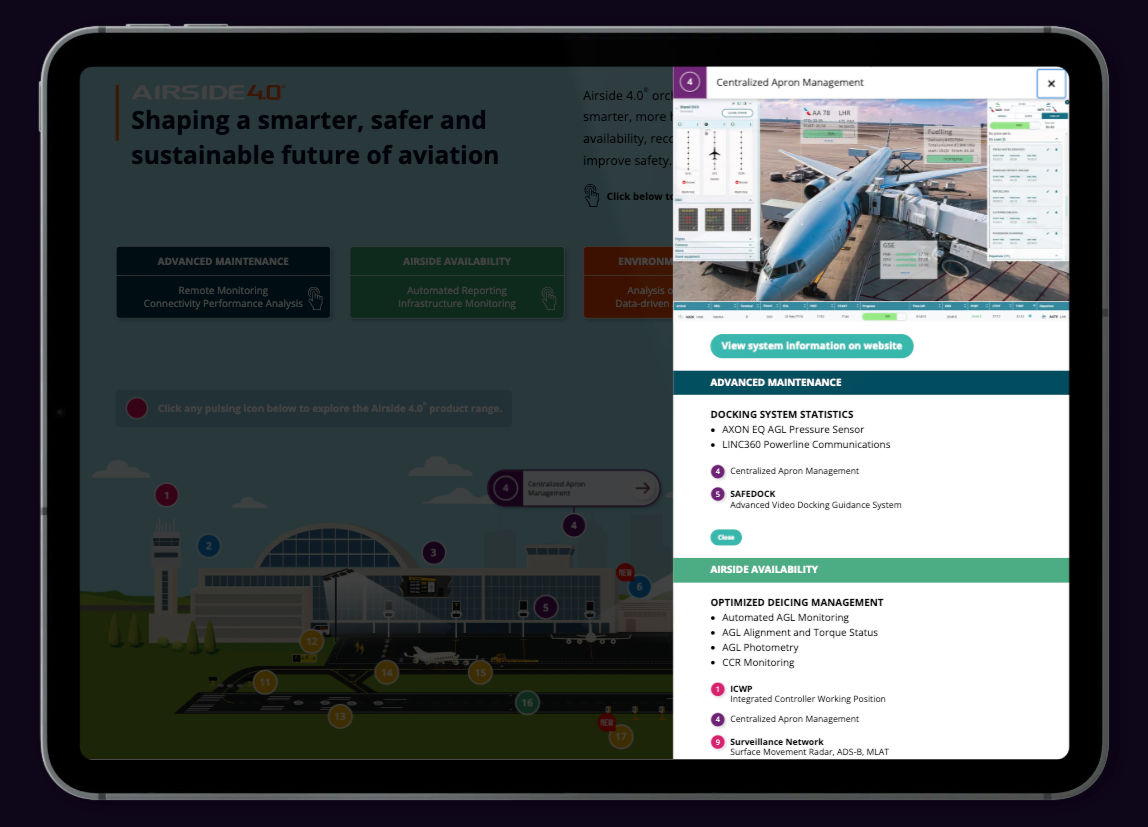
Interactive Brochure for ADB SAFEGATE’s Airside 4.0
Transforming a complex product PDF into an explorable, thought provoking interactive experience.
ADB SAFEGATE's Airside 4.0 strategy connects airside assets to deliver real-time insights for smarter decision-making.With a vast portfolio of complex systems spanning everything from airfield lighting to apron management and terminal tech, they needed a way to clearly communicate how each solution fits into the ecosystem.We created a digital brochure built around an interactive airfield illustration, to help customers explore ADB SAFEGATE's offering by product, zone, objective, or use case. By levaraging interactivty and multi-level content, we were able to transform a complex product offering into an intuitive tool to clearly define the value that the ecosystem can deliver.
Make complex content accessibleHelp users navigate numerous advanced airside technologies through an intuitive, visually driven interface.
Organise by airport objectivesSplit the experience into the four strategic objectives of Airside 4.0.
Make complexity approachableAllow users to approach the ecosystem from use-case down, or from the individual product level up, to help explain how the different parts of the ecosytem work together.
Show value and ROIPresent strategic messaging around investment impact, digital transformation, and efficiency gains across the ecosystem.
Reducing information overloadA lot of infomation and technical data needed to be included, which proved challenging to do with static PDF. It was difficult for users to explore relevant products quickly or understand how they fit into the wider platform.Mapping products to objectivesWith so many offerings, it was vital to align individual products to key outcomes like efficiency and safety — and make it clear where each solution sits in the airport environment.Empowering different usersFrom operations to strategy, different users needed to find what mattered most to them — whether browsing use cases or searching specific solutions.
We turned ADB SAFEGATE's PDF brochure into an intuitive, interactive brochure. Users can explore by clicking on key zones of an airport schematic, each revealing product categories with colour-coded overlays. Within each category, individual technologies are accessible through expandable panels — showing visuals, use cases, and benefits. A top-level navigation also allows users to browse by strategic area: Advanced Maintenance, Airside Availability, Environmental Efficiency, and Safe Ground Movement Control.
Interactive airport schematicUsers explore the entire airside ecosystem visually, clicking into zones like the tower, apron, or terminal to reveal embedded solutions.Four strategic pillarsContent is organised around four core objectives: Advanced Maintenance, Airside Availability, Environmental Efficiency, and Safe Ground Movement Control.Expandable product panelsClick-to-reveal panels present detailed product info, imagery, use cases, and the benefits aligned with broader airside strategy.Strategic investment messagingThe experience includes messaging around digital transformation and long-term ROI — helping drive conversations with decision-makers.
The result is a digital-first, intuitive experience that lets users explore the full scope of ADB SAFEGATE's offering — while keeping things clear, focused, and aligned to their airport's needs. It's an effective way to drive engagement, help customers self-educate, and support more strategic conversations across departments.From dense brochure to interactive ecosystem — the Airside 4.0 experience brings structure and clarity to a complex product landscape.
Want to make your complex offering easier to explore?Let’s talk about how we can turn your technical content into a user-led interactive experience.
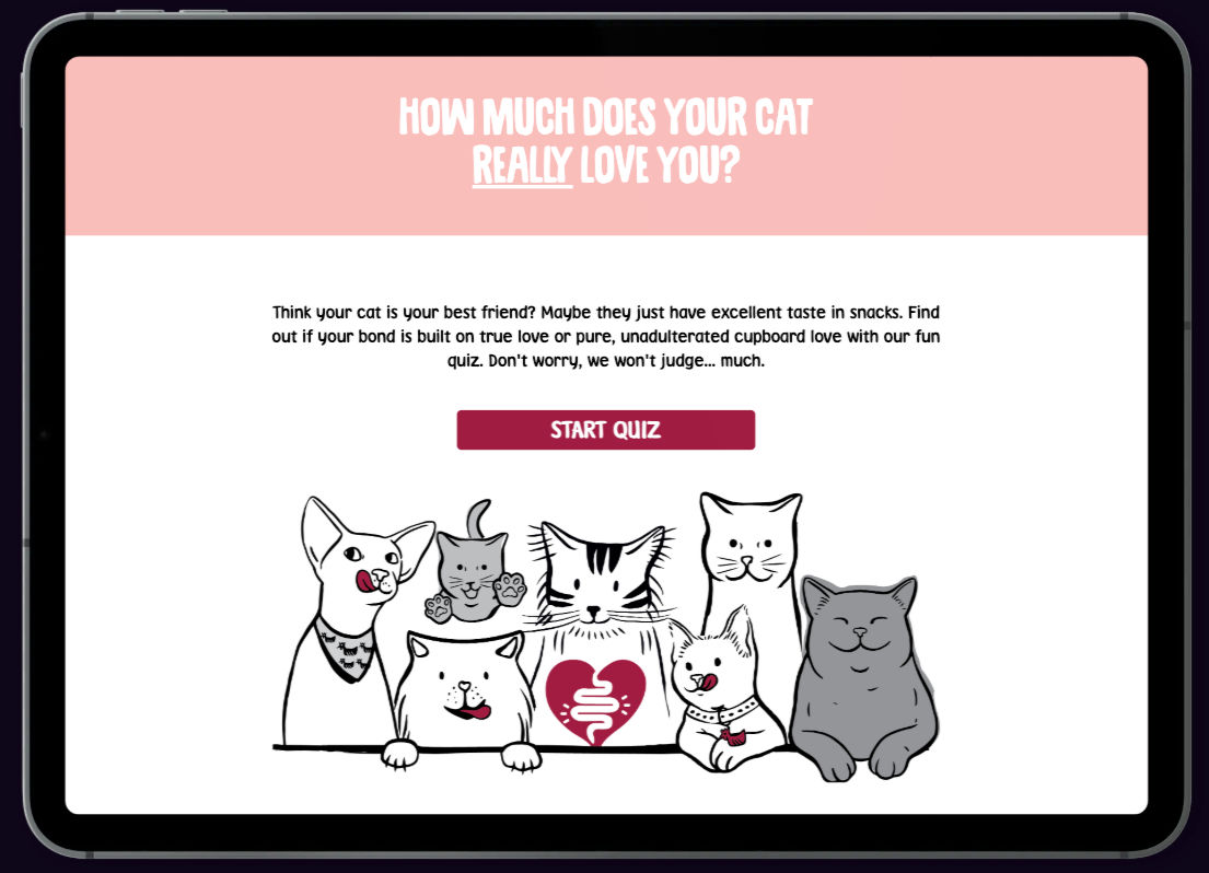
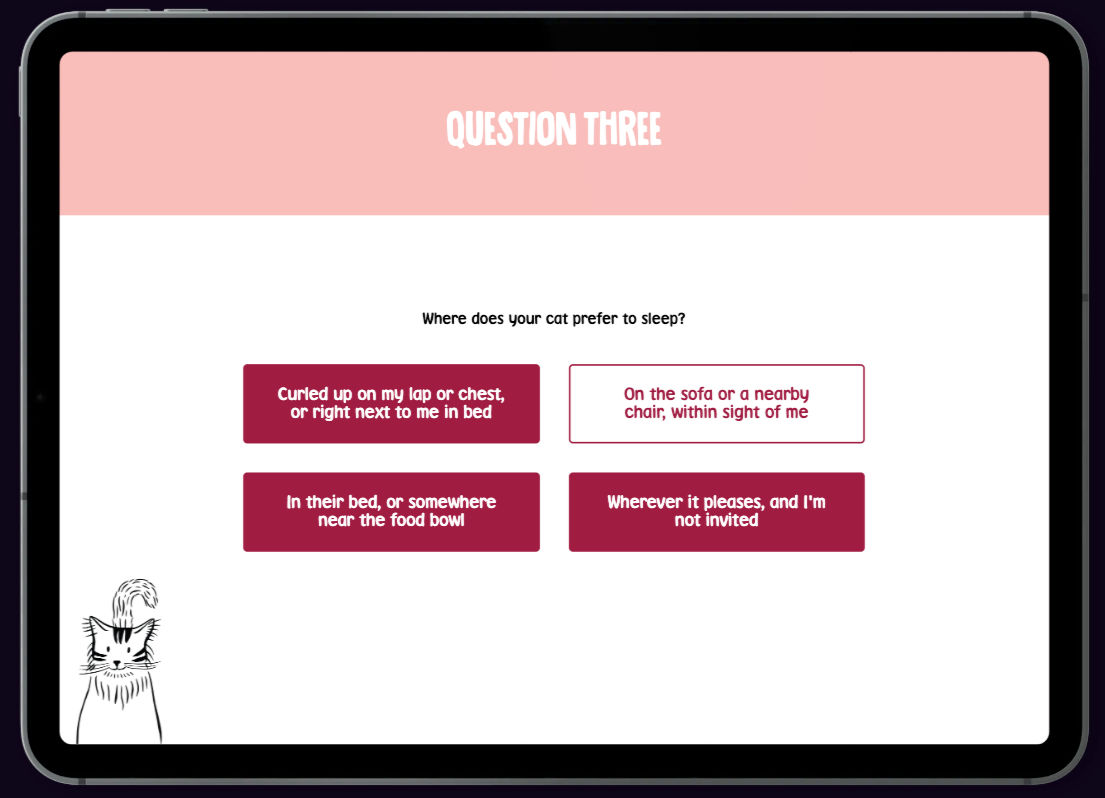
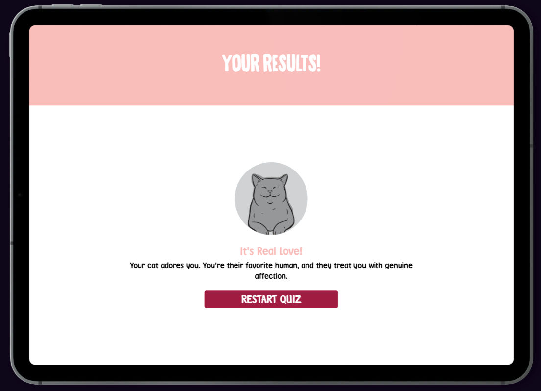
Branded Quiz for Cat-Loving Customers
Light-hearted, interactive content that gets customers clicking and sharing.
The team at Designbysoap wanted to create a light-hearted, playful quiz for their client — something quick, funny, and shareable that would connect with a pet-loving audience.They came to us to help bring their concept to life in the browser. Using the layouts, copy and illustrations provided by the team, we built a fast-loading, mobile-friendly quiz experience via PUBLEX — making it easy to embed and fun to use.
Create something fun and shareableDesignbysoap wanted to give cat lovers something to enjoy and pass along — building brand warmth through playfulness and humour.
Make it fast, friendly and easy to useWe translated the creative into a clean, responsive quiz format that loads fast and works beautifully across devices.
Embed seamlessly into the client’s siteThe PUBLEX platform made it easy to drop the final experience into the client’s existing site — looking like a native piece of content.
Deliver quickly and efficientlyWe worked closely with Designbysoap to turn their quiz into a working product — keeping the process lean and the turnaround fast.
A creative idea, but it needed a platformThe concept, design and copy were in place — but the team needed a way to bring it to life interactively, with minimal code and maximum speed.Simple structure, fun experienceWe needed to ensure that the quiz structure was tight, responsive, and seamless — without distracting from the personality-packed content.Slick user experience on all devicesIt had to look and feel smooth, load fast, and work well across mobile and desktop — while fitting neatly into the client’s own site design.
We took the visuals, layout and copy provided by Designbysoap and brought them to life as an interactive quiz via the PUBLEX platform. The result is a snappy, shareable, browser-based experience that’s easy to embed, easy to play, and impossible not to smile at. The project was turned around quickly — with a smooth collaboration and a simple path from concept to completion.
Multiple result typesEach outcome delivers a playful summary of your cat’s “true feelings” — with tone and visuals created by the Designbysoap team.Quick turnaroundBuilt and delivered on a tight timeline — with creative provided by Designbysoap and digital delivery via PUBLEX.Clean integrationThe finished quiz was easy to embed in the client’s website — no dev time needed, no compromise on appearance or functionality.Mobile-friendly experienceOptimised for mobile and desktop, the quiz is smooth, fast, and intuitive — making it perfect for quick, on-the-go fun.
Sometimes, the best kind of brand engagement is just a little moment of joy. This project proves that with the right concept and a clean digital build, even something small can generate big smiles. The finished quiz is quick, funny and feels great to use — helping pet owners connect with a brand in a way that feels entirely on their terms.It’s now live on the client’s site and getting shared among cat lovers — a great little example of collaboration done right.
Need help turning a great idea into a working interactive?We help creative teams like Designbysoap bring content to life quickly and beautifully — all without custom code.
Helping Panametrics’ customers navigate a wide, technical product range with confidence and clarity.
Panametrics offers more than 20 flowmeter products — each tailored for different industries, applications, and technical requirements. With so many options, it was difficult for customers to know which product best fit their needs, and for sales teams to respond efficiently.The Flowmeter Explorer builds on Panametrics’ existing product materials, transforming them into an interactive tool that helps users quickly narrow down choices and request guidance. It’s a surprisingly content-rich solution that supports both sales engagement and lead generation — fully integrated with their internal systems.
Filter a large product catalogueAllow users to narrow options by industry, application, meter type, and other technical variables.
Improve product visibilityShowcase detailed product specs, datasheets, and technical highlights in a user-friendly format.
Drive qualified enquiriesEnable users to request quotes and generate sales interest directly from the tool — creating warm, high-intent leads.
Support smarter decision-makingHelp users understand where and how each product is used, making their selection process faster and more informed.
A diverse and detailed product setPanametrics serves multiple sectors — from oil and gas to water utilities. Each flowmeter has unique features, and presenting that range without overwhelming users was a challenge.Legacy materials and siloed infoBefore the tool, product information lived across various datasheets and PDFs, making it difficult to compare or share easily with prospects.Creating a more seamless customer journeyWithout an integrated enquiry path, users had to manually reach out — which added steps to the process and made timely follow-up harder to achieve.
We created an interactive Flowmeter Explorer that allows users to filter products by technical criteria, industry fit, and application. The results update dynamically, and each product is supported with specs, downloads, and an integrated quote request function — sending details directly to Panametrics’ sales and marketing systems for follow-up.
Multi-layer filteringUsers can apply multiple filters to explore the best-fitting products by application, technology, and key features.Live product displayFiltered results appear instantly with imagery, downloadable specs, and a focus on real-world applications.Quote request systemUsers can add products to a quote list and submit instantly — generating warm leads and notifying the sales team in real time.Connected to CRMAll enquiries feed directly into Panametrics’ marketing systems, supporting automated nurture and sales workflows.
The Flowmeter Explorer provides a more structured way to present Panametrics’ extensive product range — giving users a practical starting point for selecting the right flowmeter and requesting further guidance where needed.With over 20 detailed product listings, smart filtering, and integrated quote requests, it’s a surprisingly content-rich tool that supports both customer clarity and internal lead routing — with potential to grow even further alongside evolving product guides and sales systems.
Want to simplify your product range?Let’s talk about creating a product selector that works for your customers — and your pipeline.
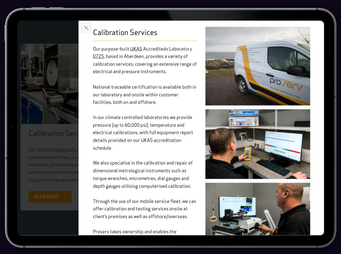
Creating a complex interactive brochure
Turning trusted technical content into an interactive, intuitive user experience
Proserv’s testing and calibration brochure contained a wide range of detailed service information. The goal was to make this content easier to navigate and explore in a digital format.We structured the content into an interactive Lex — enabling users to access information more efficiently through layered layouts, pop-ups, and modular sections.
Organise content for clarityStructure the content into clear sections and layers, making it easier for users to explore at their own pace.
Introduce interactive layersUse pop-ups, expandable accordions, and modular layouts to reveal detail progressively and keep navigation smooth.
Support informed decision-makingProvide fast access to product details, service specs, and case studies — all in context and easy to explore.
Uphold brand qualityDeliver a clean, visually consistent design aligned with Proserv’s professional standards and visual identity.
Translating expertise into interactionProserv’s content was already rich and authoritative. The challenge was to retain that depth while making it even more accessible and engaging in a digital context.Designing intuitive pathwaysThe Lex needed to serve users with different goals — from quick scanning to in-depth research — through a clearly structured and highly navigable format.Balancing detail and simplicityIt was essential to deliver technical information in a format that felt light, discoverable, and easy to use — especially on mobile devices.
The solution was a bespoke Lex that layered Proserv’s service content across multiple tiers — from overview to detail — using modern interaction patterns and elegant layouts. Every element was designed for clarity, usability, and brand integrity.
Modular content designWe structured the Lex into self-contained content blocks — including pop-outs, master slides, and inline detail — giving users full control over how much to read and when.Interactive componentsCards, accordions, and pop-ups were used throughout, making it easy to present supporting information without overwhelming the main view.Table reformatting for clarityDetailed tables were reformatted with icons, whitespace, and branding — maintaining accuracy while improving readability across all devices.Case study integrationReal-world applications and use cases were woven into the layout, helping users connect product details with practical benefits.
The final Lex presents Proserv’s testing and calibration information in a structured, digital format. Users can navigate content more easily, view details on demand, and access the information they need without scrolling through long documents.Interactive elements like pop-ups, expandable sections, and reformatted tables help keep the layout clear and easy to use.
Want to bring your service content to life?Let us help you transform complex materials into a beautifully structured, fully interactive experience — tailored to your audience and brand.
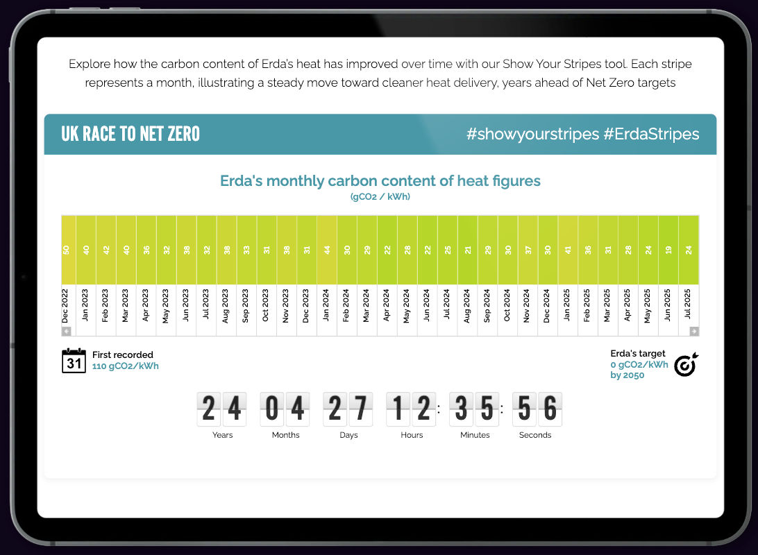
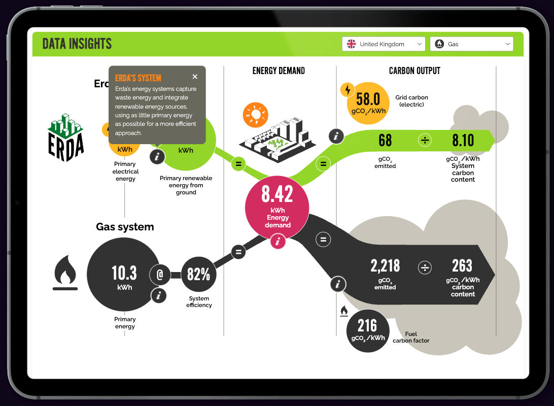
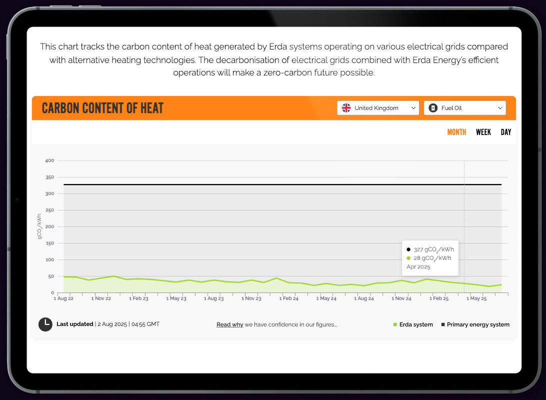
Live Carbon & Energy Dashboard for Erda Energy
In collaboration with Impulse, we turned decades of Erda's performance data into a live, explorable story.
Erda Energy are leaders in low‑carbon heating systems, with over two decades of detailed operational and carbon data.
Working alongside the talented design team at Impulse, we transformed their static datasets into a fully interactive,
embedded dashboard — seamlessly integrated into Erda’s website.
The dashboard brings Erda’s “race to net zero” to life with live‑updating charts, interactive comparisons to conventional
heating systems, and historical trends going back to 2014 — all without creating extra strain for their in‑house web team.
Make complex data simple
Turn decades of performance metrics into an accessible, intuitive online tool.
Show measurable impact
Clearly illustrate how Erda’s approach outperforms gas, oil, and biomass systems for energy use and emissions.
Enable ongoing engagement
Provide a live, continuously updating resource without requiring constant developer input.
Minimise technical overhead
Deliver as a low‑maintenance embed, hosted and maintained externally.
Too much data, not enough clarity
Erda’s dataset spanned years of performance data and environmental metrics, but it lacked an engaging, accessible way for stakeholders to explore it.
Static presentation was limiting
Reports and PDFs could only offer snapshots, making it difficult to show trends or allow users to drill into the details.
Need for low‑maintenance delivery
Any solution needed to be easy for the Erda team to keep current without tying up internal resources.
Working from Impulse’s polished UI designs, we built a fully interactive dashboard that blends Erda’s own data with national grid carbon intensity figures.
Visitors can scroll back through monthly data to 2014, compare against traditional heating technologies, and explore energy demand, input, and carbon output across sites and technologies.
Live data integration
Dashboard updates automatically with the latest available figures.
Historic timeline navigation
Scroll back through more than a decade of monthly data to reveal long‑term trends.
Comparative insights
Instantly see how Erda’s performance compares with gas, oil, and biomass systems.
Low‑maintenance embed
Hosted and maintained externally — minimal ongoing input required from Erda’s web team.
The embedded dashboard now provides a clear, engaging, and continuously updated view of Erda’s carbon‑reduction journey.
It allows customers, partners, and the public to explore exactly how their systems outperform traditional heating methods — all without adding complexity for their internal teams.
A perfect example of how strong design and specialist interactive build can combine to make complex data easy to explore and understand.
Need to bring your data to life?
Let’s talk about how we can collaborate to transform static datasets into interactive, meaningful experiences.
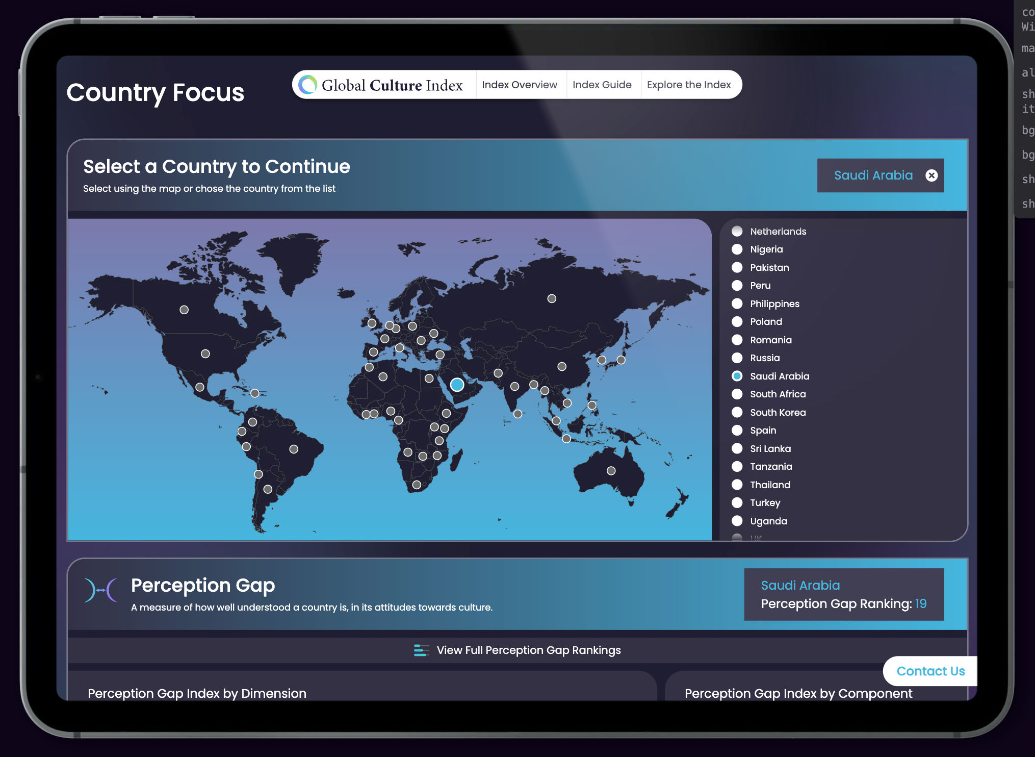
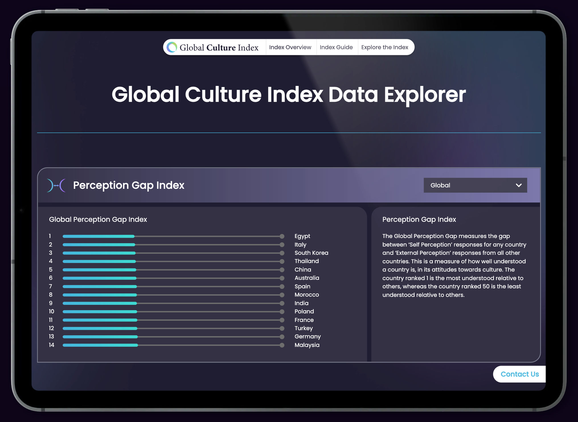
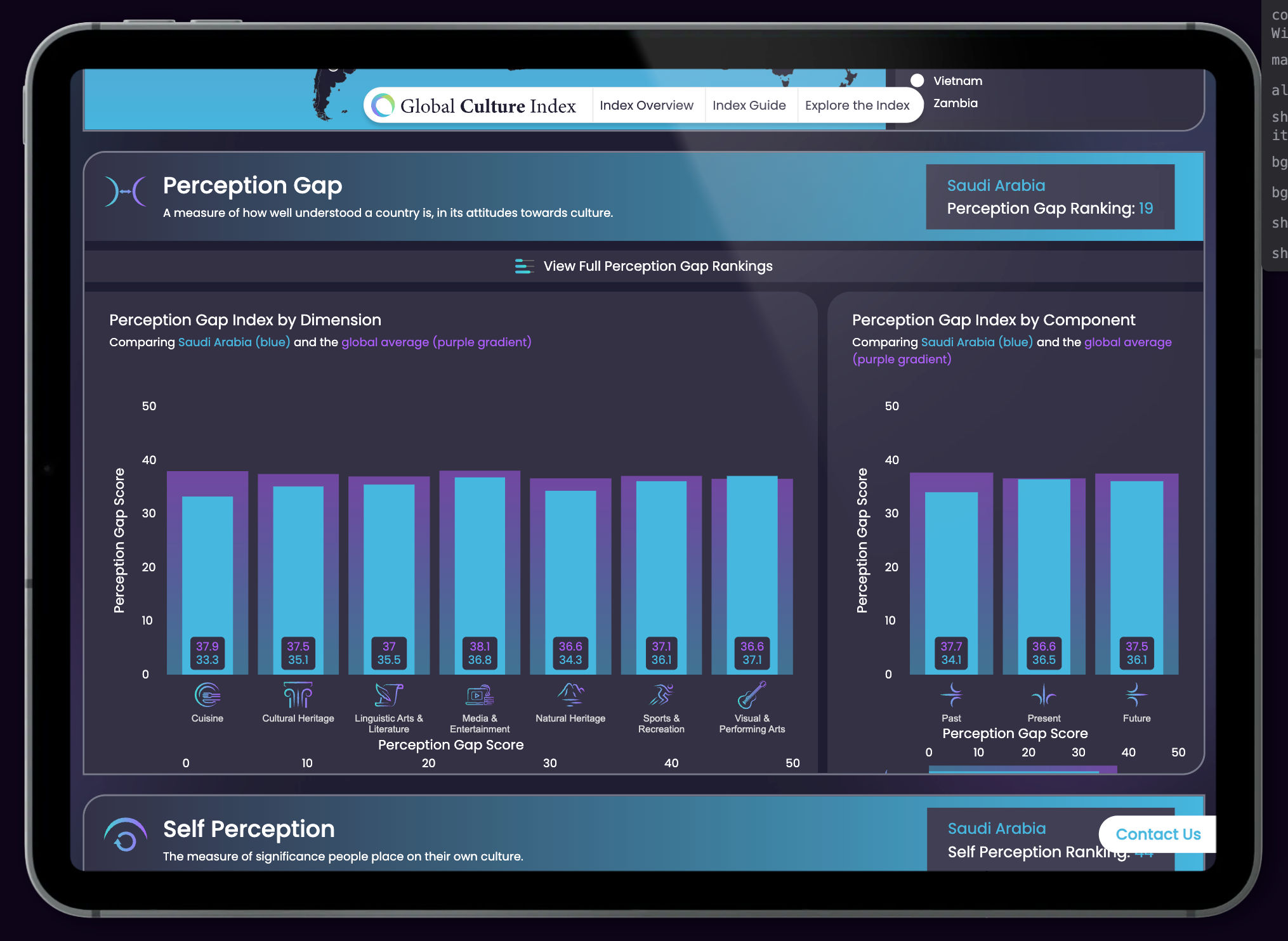
Global Cultural Index for the Riyadh Centre for Research & Studies
In collaboration with Axia Origin,
we turned a complex dataset into a dynamic, explorable platform.
The Global Cultural Index is an ambitious research initiative exploring cultural perceptions across more than 30 countries.
Commissioned by the Riyadh Centre for Research and Studies and led by Axia Origin, the project aimed to surface how individuals perceive their own country — and others — across multiple dimensions.
Our task: transform this complex dataset into a modern, interactive website with rich visualisations, intuitive navigation, and real-time comparisons — all built from scratch.
Make cultural data relatable
Build a website that bridges academic research and public understanding.
Enable global comparisons
Allow users to select and compare countries, categories, and sentiment across a dynamic index.
Design for exploration
Use interactive charts, filters, and a world map to encourage discovery through data.
Engage diverse audiences
Tailor insights for different regions and stakeholders with content that adapts to their context.
A vast dataset, difficult to decode
The raw research results were extensive and complex so needed to be accessible for public audiences.
Multi-dimensional comparisons
Users needed to explore perceptions by theme, sentiment, and geography — with easy ways to compare countries side by side.
Standalone delivery
The project needed a completely independent site, from CMS and hosting to interface design and build.
Working from Axia Origin’s methodology and dataset, we designed and built a full website for the Global Cultural Index.
Our interactive platform included an explorable world map, sortable category charts, and dynamic comparisons across user-defined parameters.
Interactive global map
Users can click on any country to view rankings and compare perceptions across multiple categories.
Live category filters
Intuitive filters allow sorting by themes such as economy, culture, governance, and more.
Responsive chart design
Every visual is fully responsive, from desktop to mobile — optimised for engagement.
Bespoke CMS & deployment
We handled everything from CMS setup to full hosting and QA — delivering a polished, turnkey solution.
The result was a seamless data-led experience that makes cultural insight both accessible and visually engaging.
Whether used by policymakers, academics, or the public, the site allows users to explore perceptions across the globe with clarity and confidence.
A great example of how smart interactive design can unlock the potential of complex research.
Turning insight into experience
If you’re working on data-heavy projects, let’s talk about how interactivity can bring your message to life.
Trusted by
A Final Version Ltd ProductFinal Version LtdCompany Number: 06557837Cherry Hill,Maidstone Road,Nettlestead,Maidstone,ME18 5HEUNITED KINGDOMhttps://finalversion.co.uk
 {{/imgSrc}}